Graphically representing estimation table
Represent point and interval estimates using ggplot2
By Pallav Routh in Estimation Visualization
August 13, 2022
I have never been a fan of showing clunky long estimation tables in research presentations. In this blog post, I show how to represent the coefficient, standard error, p values and interval estimates from a typical estimation on a graph or plot.
To generate the ggplot, I will continue using the “scientific” theme I had created in a previous post.
theme_scientific <-
  theme(axis.line = element_line(color = "black"),
        axis.text.x = element_text(color = "black",
                                   size = 12,
                                   margin = unit(c(0.2, 0.1, 0.1, 0.5), "cm")),
        axis.text.y = element_text(color = "black",
                                   size = 12,
                                   margin = unit(c(0.1, 0.1, 0.2, 0.1), "cm")),
        axis.title = element_text(colour = "black", size = 12),
        axis.ticks.length = unit(-0.30, "cm"),
        panel.background = element_rect(fill = "white", colour = "white"),
        panel.border = element_rect(colour = "black", fill = NA, size = 0.2),
        panel.grid.minor = element_blank(),
        panel.grid.major = element_line(colour = "#ddd8d8", linetype = 1, size = 0.5),
        strip.placement = "outside")
Let’s begin by running an estimation. I will use the mtcars dataset to run a simple OLS regression.
lmfit <- lm(mpg ~ wt*cyl + am + gear, data = mtcars)
Here is the output from the regression model -
summary(lmfit)
##
## Call:
## lm(formula = mpg ~ wt * cyl + am + gear, data = mtcars)
##
## Residuals:
##     Min      1Q  Median      3Q     Max
## -4.8339 -1.3594 -0.4773  1.2972  5.3204
##
## Coefficients:
##             Estimate Std. Error t value Pr(>|t|)
## (Intercept)  57.1698     7.5338   7.588 4.69e-08 ***
## wt           -9.3089     2.8998  -3.210  0.00351 **
## cyl          -3.9487     1.1331  -3.485  0.00176 **
## am           -0.6179     1.8671  -0.331  0.74333
## gear         -0.1916     1.0636  -0.180  0.85845
## wt:cyl        0.8600     0.3835   2.243  0.03367 *
## ---
## Signif. codes:  0 '***' 0.001 '**' 0.01 '*' 0.05 '.' 0.1 ' ' 1
##
## Residual standard error: 2.435 on 26 degrees of freedom
## Multiple R-squared:  0.8631,	Adjusted R-squared:  0.8368
## F-statistic: 32.79 on 5 and 26 DF,  p-value: 1.951e-10
Now let’s store the output (the main estimation table) above in a data frame. We can do this easily with the tidy function from the broom package.
lmfit_tidy <- tidy(lmfit)
lmfit_tidy
## # A tibble: 6 × 5
##   term        estimate std.error statistic      p.value
##   <chr>          <dbl>     <dbl>     <dbl>        <dbl>
## 1 (Intercept)   57.2       7.53      7.59  0.0000000469
## 2 wt            -9.31      2.90     -3.21  0.00351
## 3 cyl           -3.95      1.13     -3.48  0.00176
## 4 am            -0.618     1.87     -0.331 0.743
## 5 gear          -0.192     1.06     -0.180 0.858
## 6 wt:cyl         0.860     0.383     2.24  0.0337
I am going to make some changes to the above table. First, I will remove the ‘intercept’ row because in day to day situations researchers rarely interpret the intercept. I will rename some of the columns. I will also initiate an index or row number (this will help me later when creating the plot).
lmfit_tidy <-
  tidy(lmfit) %>%
    rename("std_error" = "std.error","p_value" = "p.value") %>%
    filter(term != "(Intercept)") %>%
    mutate(index = 1:n()) %>%
    relocate(index, .before = term)

lmfit_tidy
## # A tibble: 5 × 6
##   index term   estimate std_error statistic p_value
##   <int> <chr>     <dbl>     <dbl>     <dbl>   <dbl>
## 1     1 wt       -9.31      2.90     -3.21  0.00351
## 2     2 cyl      -3.95      1.13     -3.48  0.00176
## 3     3 am       -0.618     1.87     -0.331 0.743
## 4     4 gear     -0.192     1.06     -0.180 0.858
## 5     5 wt:cyl    0.860     0.383     2.24  0.0337
I will also store the variables from the estimation table in a vector as this will also be useful later on in the preparation of the plot -
terms <- unique(lmfit_tidy$term)
Now let’s create a plot. The main idea is to create a scatter plot where the points are the estimates for each variable which would be represented on one of the axis. The other important aspect is to represent the confidence of the point estimate using a error bar.
Here is the code to do that -
lmfit_tidy %>%
  mutate(lcl = estimate - 1.94 * std_error,
         ucl = estimate + 1.94 * std_error) %>%
  # using index rather than variable as y axis
  # allows me to keep the y axis as continuous rather
  # than discrete which allows for more flexibility
  # such as a duplicate axis for y
  ggplot(aes(x = estimate, y = index)) +
      geom_point(size = 3) +
      geom_errorbar(mapping = aes(xmin = lcl, xmax = ucl),
                    width = 0.20, size = 0.8) +
      geom_vline(aes(xintercept = 0), col = "blue", linetype = 2) +
      # here I replace the index with the variable names
      # and specify a duplicate axis
      scale_y_continuous(breaks = 1:length(terms),
                         labels = terms,
                         sec.axis = dup_axis(name = " ", labels = NULL)) +
      scale_x_continuous(breaks = seq(-15,4,2),
                         sec.axis = dup_axis(name = " ", labels = NULL)) +
      labs(title = "Estimates from OLS regression",
           subtitle = "Dependent variable : mpg",
           x = "estimate",
           y = "variable") +
      theme_scientific
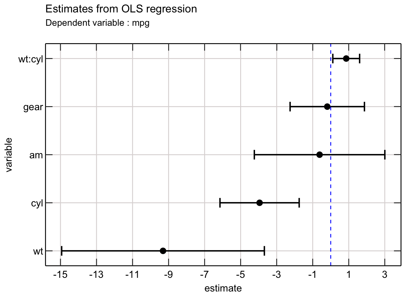
Awesome! This is so much better than reading a table.
The dots represent the point estimates for each variable with the error bar representing the confidence of the point estimates. The vertical line on zero will allow readers to understand whether each estimate is significantly different from 0 (which is usually the null hypothesis).
We can easily improve the above picture by adding colors to each error bar to indicate whether each coefficient is significant (at the 5% level).
Here is how I do that -
lmfit_tidy %>%
  mutate(lcl = estimate - 1.94 * std_error,
         ucl = estimate + 1.94 * std_error,
         significant = as.factor(ifelse(p_value < 0.1,1,0))) %>%
  ggplot(aes(x = estimate, y = index)) +
      geom_errorbar(mapping = aes(xmin = lcl, xmax = ucl, color = significant),
                    width = 0.20, size = 0.8) +
      # moved the geom point after the error bar
      geom_point(size = 3) +
      geom_vline(aes(xintercept = 0), col = "blue", linetype = 2) +
      scale_y_continuous(breaks = 1:length(terms),
                         labels = terms,
                         sec.axis = dup_axis(name = " ", labels = NULL)) +
      scale_x_continuous(breaks = seq(-15,4,2),
                         sec.axis = dup_axis(name = " ", labels = NULL))+
      # red indicates insignificant while blue
      # is significant
      scale_color_manual(values = c("red","blue")) +
      labs(title = "Estimates from OLS regression",
           subtitle = "Dependent variable : mpg",
           x = "estimate",
           y = "variable") +
      theme_scientific +
      # I choose to remove the legend and instead add
      # a footnote for explaining the color codes
      theme(legend.position = "none") +
      labs(caption = "Red indicates insignificant")
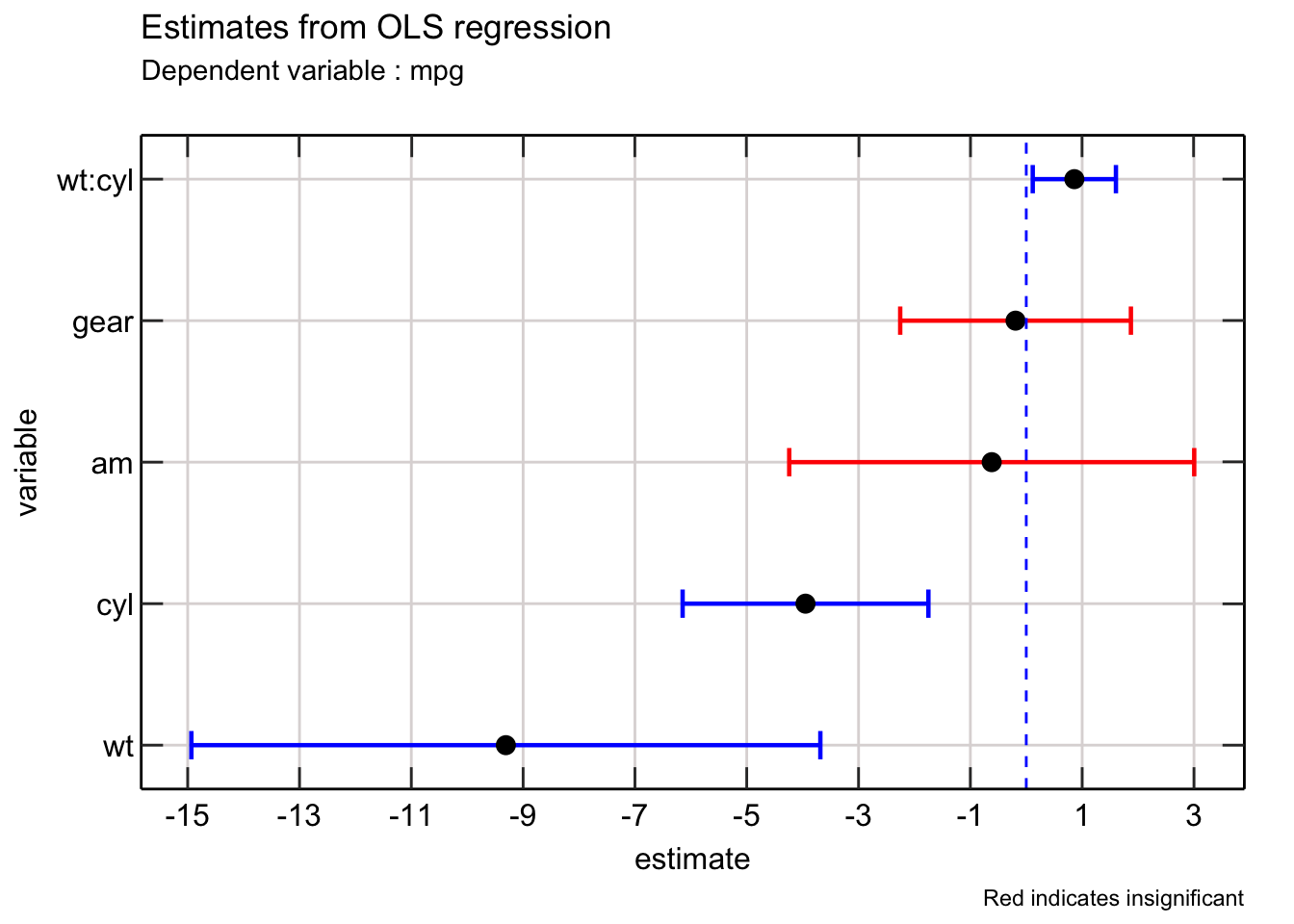
Excellent! We can further improve the above plot in a few ways.
First, we can add the value of the coefficient to make it easier for readers to understand where the point lies on the x axis. Second we can add more information such as the standard error of the estimates and p value associated with each estimate.
I use TeX function from latex2exp package to annotate the textual information to the existing plot. I write a helpful function that lets me format the number appropriately.
Here is how I do that -
fmt_no <- function(number) {
  return(format(round(number,2), nsmall = 2))
}

lmfit_tidy %>%
  mutate(lcl = estimate - 1.94 * std_error,
         ucl = estimate + 1.94 * std_error,
         significant = as.factor(ifelse(p_value < 0.1,1,0))) %>%
  mutate(lab = glue("$\\beta$ = {fmt_no(estimate)}, se = {fmt_no(std_error)}, p = {fmt_no(p_value)}")) %>%
  ggplot(aes(x = estimate, y = index, label = TeX(lab, output = "character"))) +
      geom_text(parse = TRUE, nudge_y = -0.5) +
      geom_errorbar(mapping = aes(xmin = lcl, xmax = ucl, color = significant),
                    width = 0.20, size = 0.8) +
      geom_point(size = 3) +
      geom_vline(aes(xintercept = 0), col = "blue", linetype = 2) +
      scale_y_continuous(breaks = 1:length(terms),
                         labels = terms,
                         sec.axis = dup_axis(name = " ", labels = NULL)) +
      scale_x_continuous(breaks = seq(-15,4,2),
                         sec.axis = dup_axis(name = " ", labels = NULL)) +
      scale_color_manual(values = c("red","blue")) +
      labs(title = "Estimates from OLS regression",
           subtitle = "Dependent variable : mpg",
           x = "estimate",
           y = "variable") +
      theme_scientific +
      theme(legend.position = "none") +
      labs(caption = "Red indicates insignificant")
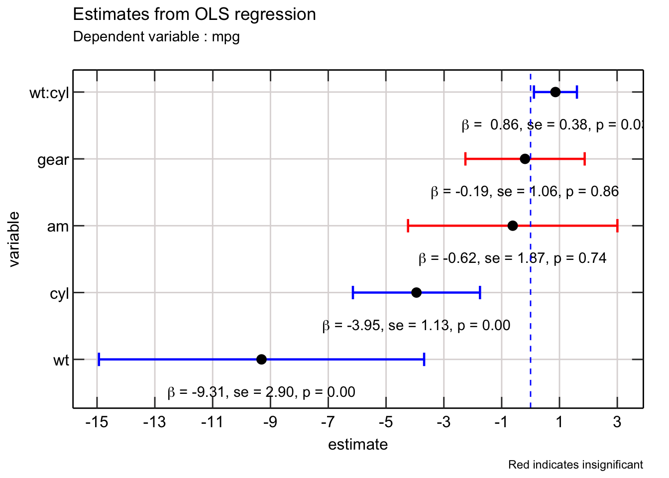 So nice!
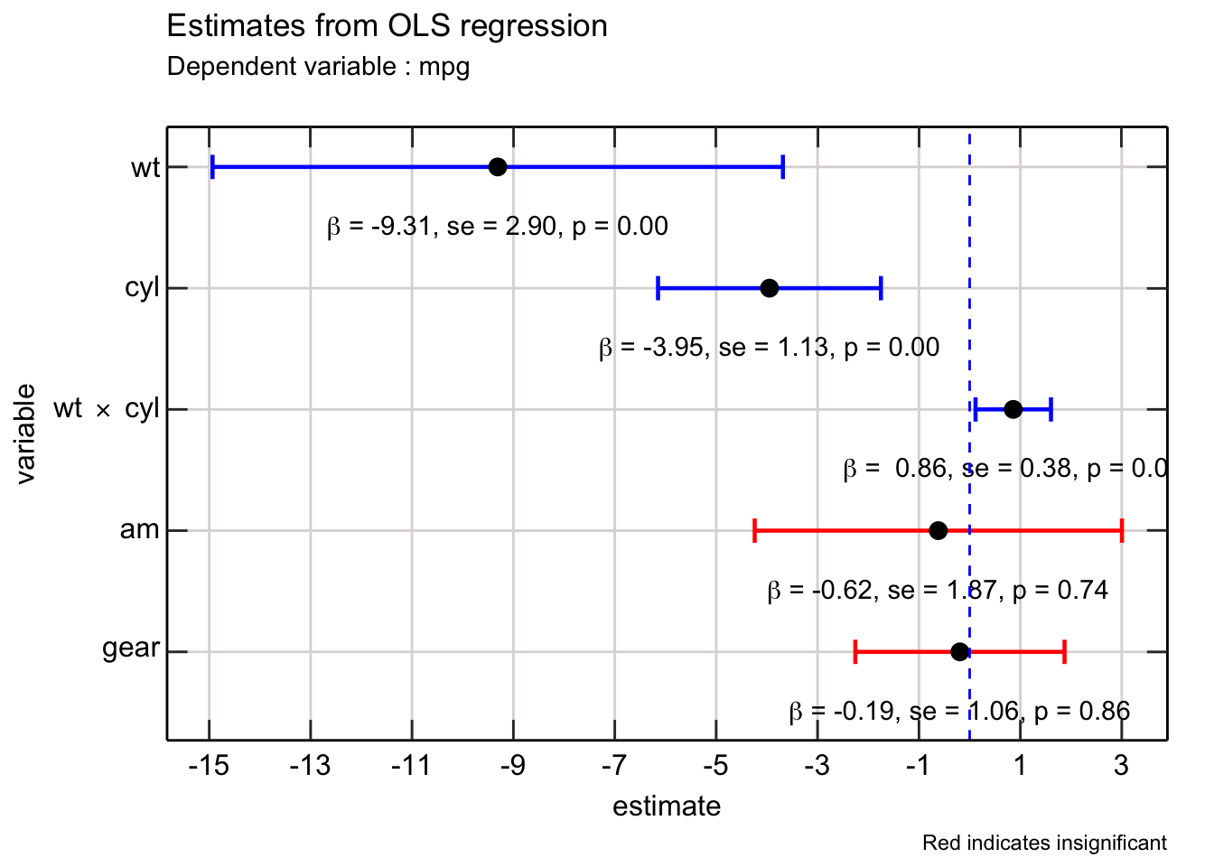
The final finishing touch would be to change the ordering of the variables - ideally the interaction between wt and cyl should be right after it. Additionally, it would be helpful to replace the : notation with the x notation for relaying interaction between two variables.
One way to move wt:cyl close to wt and cyl, is to group them. Then use arrange to sort wt:cyl with wt and cyl. Finally, initialize a new index to capture this arrangement.
lmfit_tidy_rearranged <-
  lmfit_tidy %>%
    mutate(wt_cyl = ifelse(grepl("wt|cyl",term),1,0)) %>%
    group_by(wt_cyl) %>%
      mutate(group_idx = 1:n()) %>%
    ungroup() %>%
    arrange(desc(wt_cyl),group_idx) %>%
    mutate(index_rearranged = 1:n())

terms_rearraged <- lmfit_tidy_rearranged$term
I use this rearranged data to re create the plot -
lmfit_tidy_rearranged %>%
  mutate(lcl = estimate - 1.94 * std_error,
         ucl = estimate + 1.94 * std_error,
         significant = as.factor(ifelse(p_value < 0.1,1,0))) %>%
  mutate(lab = glue("$\\beta$ = {fmt_no(estimate)}, se = {fmt_no(std_error)}, p = {fmt_no(p_value)}")) %>%
  ggplot(aes(x = estimate, y = index_rearranged, label = TeX(lab, output = "character"))) +
      geom_text(parse = TRUE, nudge_y = -0.5) +
      geom_errorbar(mapping = aes(xmin = lcl, xmax = ucl, color = significant),
                    width = 0.20, size = 0.8) +
      geom_point(size = 3) +
      geom_vline(aes(xintercept = 0), col = "blue", linetype = 2) +
      # reverse y axis
      # use the new rearranged terms here
      scale_y_reverse(breaks = 1:length(terms_rearraged),
                      labels = terms_rearraged,
                      sec.axis = dup_axis(name = " ", labels = NULL))  +
      scale_x_continuous(breaks = seq(-15,4,2),
                         sec.axis = dup_axis(name = " ", labels = NULL)) +
      scale_color_manual(values = c("red","blue")) +
      labs(title = "Estimates from OLS regression",
           subtitle = "Dependent variable : mpg",
           x = "estimate",
           y = "variable") +
      theme_scientific +
      theme(legend.position = "none") +
      labs(caption = "Red indicates insignificant")
 In order to replace the
 : notation with the x notation, it would be helpful to write a function that detects the interaction and then formats the text so that it can used within a TeX function.
format_terms <- function(var_string){
  has_interaction <- grepl(":",var_string)
  if (has_interaction) {
    vars <- unlist(strsplit(var_string,":"))
    return(glue("{vars[1]} $\\times$ {vars[2]}"))
  }
  else {
    return(var_string)
  }
}

terms_rearraged_formatted <- map_chr(terms_rearraged,format_terms)


lmfit_tidy_rearranged %>%
  mutate(lcl = estimate - 1.94 * std_error,
         ucl = estimate + 1.94 * std_error,
         significant = as.factor(ifelse(p_value < 0.1,1,0))) %>%
  mutate(lab = glue("$\\beta$ = {fmt_no(estimate)}, se = {fmt_no(std_error)}, p = {fmt_no(p_value)}")) %>%
  ggplot(aes(x = estimate, y = index_rearranged, label = TeX(lab, output = "character"))) +
      geom_text(parse = TRUE, nudge_y = -0.5) +
      geom_errorbar(mapping = aes(xmin = lcl, xmax = ucl, color = significant),
                    width = 0.20, size = 0.8) +
      geom_point(size = 3) +
      geom_vline(aes(xintercept = 0), col = "blue", linetype = 2) +
      scale_y_reverse(breaks = 1:length(terms_rearraged),
                      labels = TeX(terms_rearraged_formatted),
                      sec.axis = dup_axis(name = " ", labels = NULL)) +
      scale_x_continuous(breaks = seq(-15,4,2),
                         sec.axis = dup_axis(name = " ", labels = NULL)) +
      scale_color_manual(values = c("red","blue")) +
      labs(title = "Estimates from OLS regression",
           subtitle = "Dependent variable : mpg",
           x = "estimate",
           y = "variable") +
      theme_scientific +
      theme(legend.position = "none") +
      labs(caption = "Red indicates insignificant")
You can use this framework in any estimation.