Matlab style plots using ggplot2 (Part 2)
Create Matlab style plots in ggplot2 facets
By Pallav Routh in Manuscript Visualization
January 14, 2022
In an earlier post I demonstrate how ggplot can be used to replicate Matlab style plots. In this short post I demonstrate how to apply the same design to ggplot2 facets.
Here is the “scientific” theme from the previous post
theme_scientific <-
  theme(axis.line = element_line(color = "black"),
        axis.text.x = element_text(color = "black",
                                   size = 12,
                                   margin = unit(c(0.2, 0.1, 0.1, 0.5), "cm")),
        axis.text.y = element_text(color = "black",
                                   size = 12,
                                   margin = unit(c(0.1, 0.1, 0.2, 0.1), "cm")),
        axis.title = element_text(colour = "black", size = 12),
        axis.ticks.length = unit(-0.30, "cm"),
        panel.border = element_rect(colour = "black", fill = NA, size = 0.2),
        panel.background = element_rect(fill = "white", colour = "white"),
        panel.grid.minor = element_blank(),
        panel.grid.major = element_line(colour = "#ddd8d8", linetype = 1, size = 0.5),
        strip.placement = "outside")
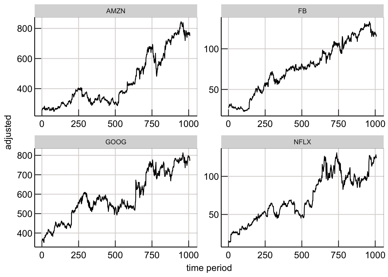
Let’s use this theme to create our facetted plot. In this example, we will create a time series plot showing historical stock prices for 4 major companies using the FANG dataset -
data("FANG", package = "tidyquant")

FANG %>%
  group_by(symbol) %>%
    mutate(`time period` = 1:n()) %>%
  ungroup() %>%
  ggplot(aes(x = `time period`, y = adjusted)) +
   geom_line() +
   facet_wrap(~symbol, scales = "free") +
   theme_scientific
A major issue with using facets is that one cannot pick custom breaks and limits for the axis of each facet (let alone automating it). Thankfully, there is a funcation called facetted_pos_scales() from the ggh4x package that lets you do that.
To use this function, we need to custom breaks and limits for each facet. However a better approach would be to automate this task. Lets create a function that create such breaks and limits for the x and y axis -
auto_breaks <- function(series, num_breaks = 4, adjustment_factor = 2) {
  min_series <- min(series, na.rm = TRUE)
  max_series <- max(series, na.rm = TRUE)
  skips <- (max_series - min_series) / num_breaks
  min_adjusted <- min_series - (skips / adjustment_factor)
  max_adjusted <- max_series + (skips / adjustment_factor)
  return(
    c(min_adjusted,
    seq(min_series,max_series,skips),
    max_adjusted)
    )
}

auto_lims <- function(breakvals) {
  min_break <- min(breakvals, na.rm = TRUE)
  max_break <- max(breakvals, na.rm = TRUE)
  return(c(min_break, max_break))
}
Now all I need to do is filter the data from each company in FANG and feed it to the above function. Here is one way you can do that `
FANG %>%
  group_by(symbol) %>%
    mutate(`time period` = 1:n()) %>%
  ungroup() %>%
  {
    temp_df <- .
    symbs <- c("AMZN","FB","GOOG","NFLX")
    symb_dfs <- purrr::map(symbs, ~ filter(temp_df, symbol == .x))
    breaks_list <- purrr::map(symb_dfs, ~ round(auto_breaks(.$adjusted,
                                                            num_breaks = 3,
                                                            adjustment_factor = 1)
                                                ,0))
    print(breaks_list)
    lims_list <- purrr::map(breaks_list, auto_lims)
  }
## [[1]]
## [1]   50  248  447  646  844 1043
##
## [[2]]
## [1] -14  23  60  96 133 170
##
## [[3]]
## [1] 197 351 505 659 813 967
##
## [[4]]
## [1] -26  13  52  92 131 170
It works! It chooses breaks and limits for each company.
Now the trick is to save these breaks into a list and then use it within facetted_pos_scales() from the ggh4x package.
FANG %>%
  group_by(symbol) %>%
    mutate(`time period` = 1:n()) %>%
  ungroup() %>%
  {
    temp_df <- .
    symbs <- c("AMZN","FB","GOOG","NFLX")
    symb_dfs <- purrr::map(.x = symbs, .f = ~ filter(temp_df, symbol == .x))
    breaks_list <- purrr::map(.x = symb_dfs, .f = ~ round(auto_breaks(.$adjusted,
                                                                      num_breaks = 3,
                                                                      adjustment_factor = 1),
                                                          0))
    lims_list <- purrr::map(.x = breaks_list, .f = auto_lims)
    scales_listy <- purrr::map2(.x = breaks_list,
                                .y = lims_list,
                                .f = ~ scale_y_continuous(breaks = .x,
                                                          limits = .y,
                                                          sec.axis = dup_axis(name = " ",
                                                                             labels = NULL),
                                                          expand = expansion(add = c(0,0))))

    scales_listx <- rep(list(scale_x_continuous(breaks = seq(0,1000,200),
                                                limits = c(0,1000),
                                                sec.axis = dup_axis(name = " ", labels = NULL),
                                                expand = expansion(add = c(0,0)))),
                        4)

    ggplot(.,aes(x = `time period`, y = adjusted)) +
     geom_line(color = "blue") +
     facet_wrap(~symbol, scales = "free") +
     facetted_pos_scales(y = scales_listy, x = scales_listx) +
     theme_scientific
  }
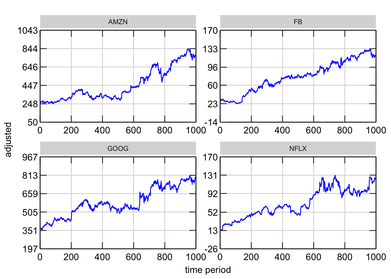
Here is the final plot. Beautiful!