Matlab style plots using ggplot2
Create Matlab style plots using ggplot2
By Pallav Routh in Manuscript Visualization
December 14, 2021
ggplot has always been my go-to library for generating images and plots for projects, presentations and manuscripts. But, I’ve never been a huge fan of ggplot built-in themes for creating plots. I’ve always wanted to re-create Matlab’s deafult
plotting theme. I think they are clean, precise and perfectly suited for scientific visualizations.
Luckily, ggplot makes it very easy to create and add your custom theme to a plot using different functions. So, in in this blog post, I go over the steps to re-create the above plotting theme used by Matlab.
Characteristic features
There are 2 features of Matlab plots that really appeal to me - (1) inward facing ticks, and (2) axes on all 4 sides. This is different from ggplot where the default behavior is to generate outward facing ticks and axes on 2 sides.
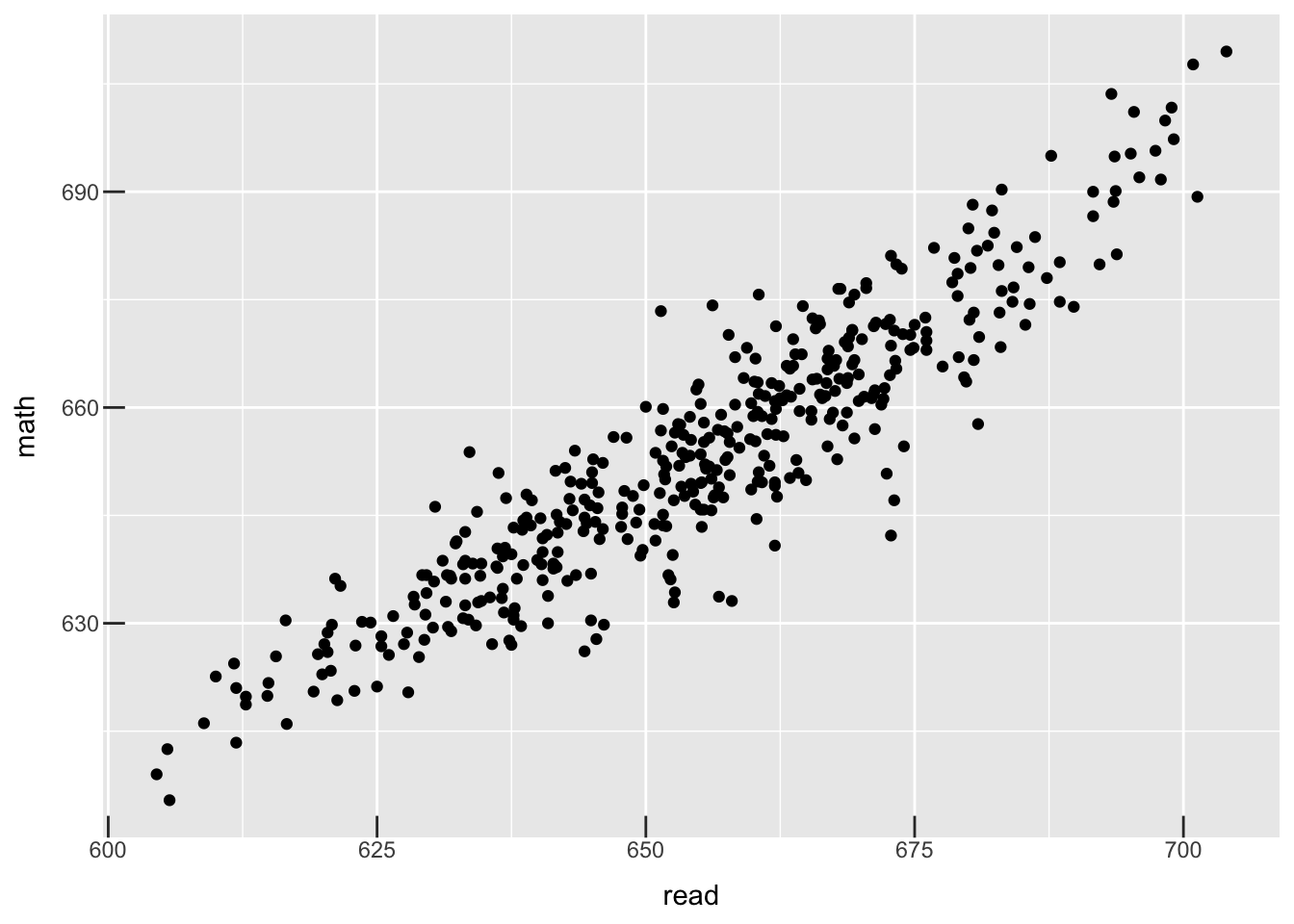
Let’s see how we can add these features to a ggplot. First, here is our basic plot g which depicts the relationship between reading scores and math scores from CASchools data in the AER library.
dataset <- readr::read_csv("https://raw.githubusercontent.com/pallavrouth/AI-Bootcamp/main/Data/caschools.csv")

g <-
  ggplot(dataset, aes(x = read, y = math)) +
    geom_point()

(g)

Inward ticks
I will use the axis.ticks.length argument within the theme() function to generate inward facing ticks. Let’s save the settings to a new theme.
theme_scientific <- theme(axis.ticks.length = unit(-0.30, "cm"))
Adding theme_scientific to g adds inward ticks.
(g + theme_scientific)
Nice! Let’s clean up the axis a little before moving forward. Let’s change the color of text on either axis to be black and of size 12.
theme_scientific <-
  theme(axis.line = element_line(color = "black"),
        axis.text = element_text(colour = "black", size = 12),
        axis.title = element_text(colour = "black", size = 12),
        axis.ticks.length = unit(-0.30, "cm"))

(g + theme_scientific)
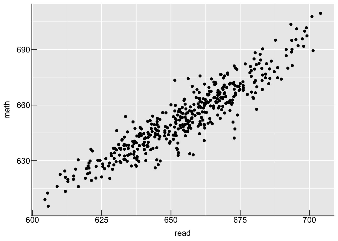
Duplicate axis
Already looking 10x better! Next, let’s add axes to all 4 sides. We can do this by using the dup_axis() function within ggplot::scale_*_*() family of functions. Here, since x and y axis are both continous, we use ggplot::scale_x_continuous() :
(g +
   scale_x_continuous(sec.axis = dup_axis(name = " ", labels = NULL)) +
   scale_y_continuous(sec.axis = dup_axis(name = " ", labels = NULL)) +
   theme_scientific)

Evenly distributed scales
We’re almost there. We need to clean up the values on x and y axis. Personally, I like adding at least 5 different equally spaced points on each axis. Rather than manually deciding what points to add to each axis, let’s write a function that will automatically pick these values for us. Here is one way to write such a function :
auto_breaks <- function(series, num_breaks = 4) {
  min_series <- min(series, na.rm = TRUE)
  max_series <- max(series, na.rm = TRUE)
  skips <- (max_series - min_series) / num_breaks
  return(seq(min_series,max_series,skips))
}
auto_breaks() takes in as a argument a numeric vector and divides the range of the vector by the desired number of breaks to generate a skip interval. It outputs a sequence of evenly distributed values from the minimum to the maximum of the vector with increments equal to skip interval. In total, num_breaks + 1 values are created. For example :
random_series <- rnorm(100, mean = 100, sd = 5)
auto_breaks(random_series)
## [1] 85.27289 91.79089 98.30889 104.82689 111.34490
Let’s now use auto_breaks() within ggplot::scale_x_continuous() to clean up the axes scales -
dataset %>%
  {
    ggplot(., aes(x = read, y = math)) +
      geom_point() +
      scale_x_continuous(breaks = round(auto_breaks(.$read),0),
                         sec.axis = dup_axis(name = " ", labels = NULL)) +
      scale_y_continuous(sec.axis = dup_axis(name = " ", labels = NULL)) +
      theme_scientific
  }
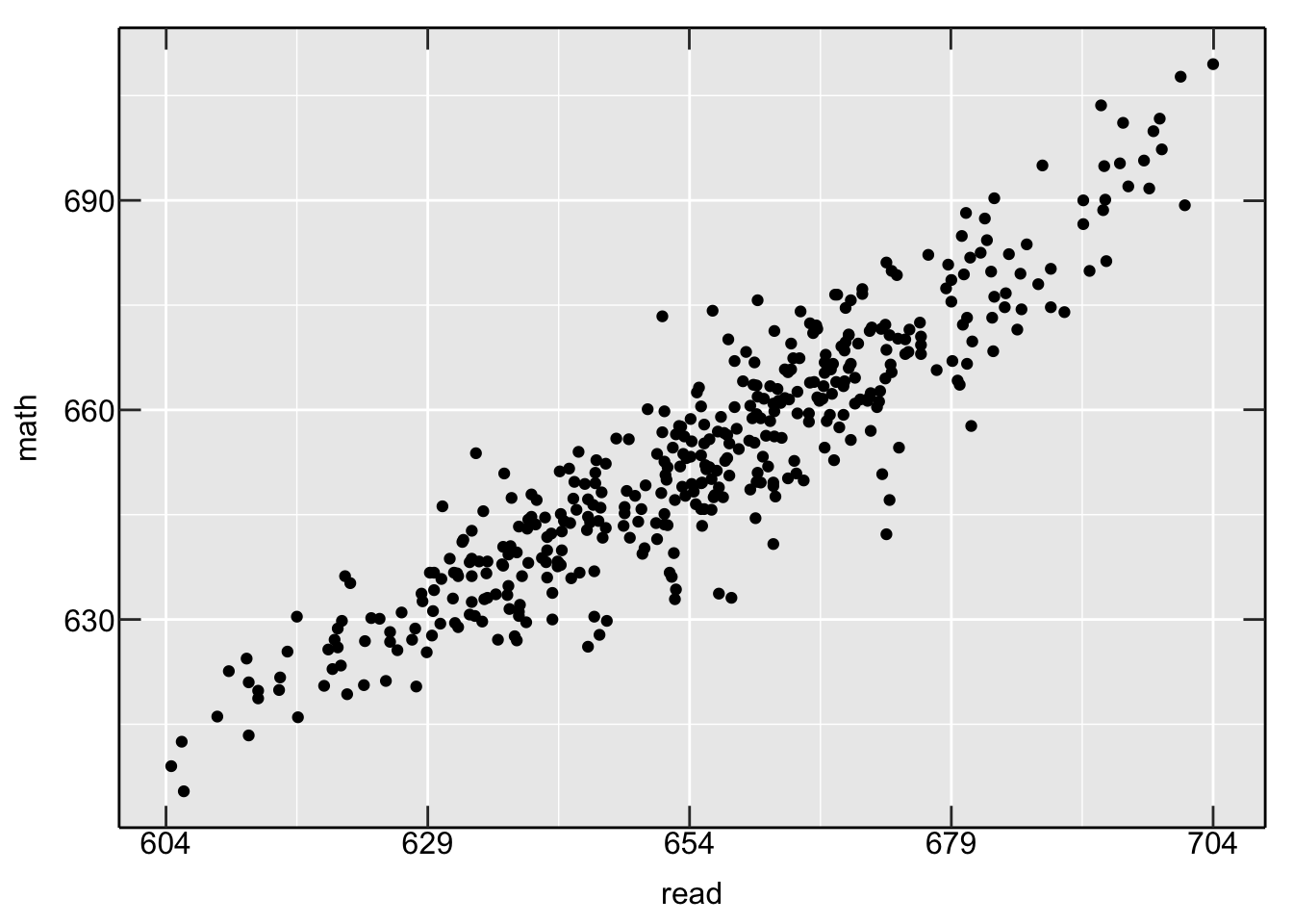
Notice how I used %>% with {} to get to the result. Using {} allows me to reference the column read from the dataset and use it as an input to the auto_breaks() function. I have also rounded up the values to the next integer. Let’s repeat this for y axis.
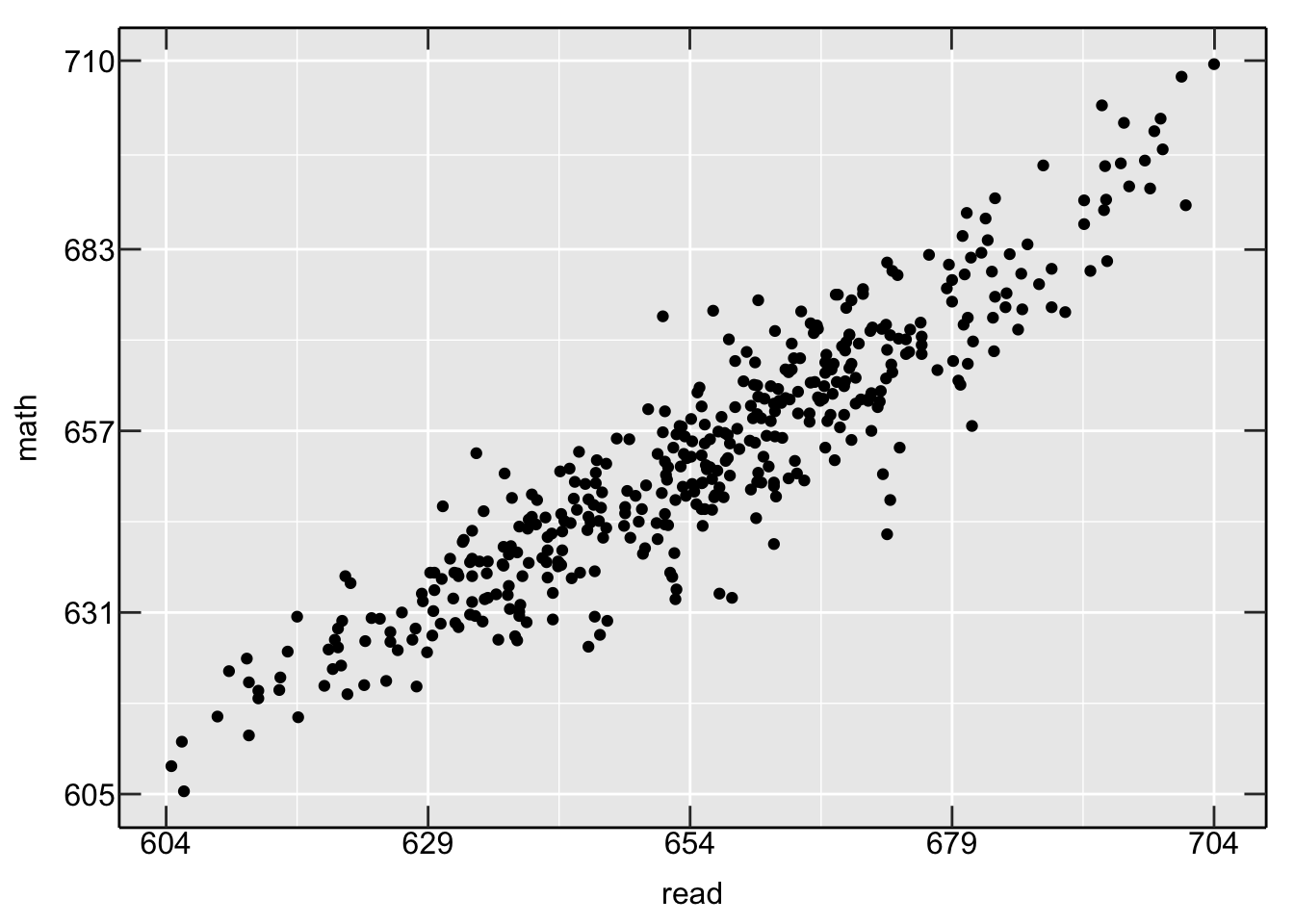
dataset %>%
  {
    ggplot(., aes(x = read, y = math)) +
      geom_point() +
      scale_x_continuous(breaks = round(auto_breaks(.$read),0),
                         sec.axis = dup_axis(name = " ", labels = NULL)) +
      scale_y_continuous(breaks = round(auto_breaks(.$math),0),
                         sec.axis = dup_axis(name = " ", labels = NULL)) +
      theme_scientific
  }
Fix origins
So much better! But, we’re not done yet. We need to fix the limits of the scales on each axes. In particular, I would like to force the numbers to start from the origin. One way to address this issue to add 2 numbers to the output from auto_breaks(). These 2 numbers are placed above and below the minimum and maximum on either scale.
We can alter auto_breaks() slightly to make provisions for these 2 numbers. Basically, we need to take the minimum (maximum) and subtract (add) a small ajustment to it. I chose the adjustment by scaling down the skip value by a certain factor.
auto_breaks <- function(series, num_breaks = 4, adjustment_factor = 2) {
  min_series <- min(series, na.rm = TRUE)
  max_series <- max(series, na.rm = TRUE)
  skips <- (max_series - min_series) / num_breaks
  min_adjusted <- min_series - (skips / adjustment_factor)
  max_adjusted <- max_series + (skips / adjustment_factor)
  return(
    c(min_adjusted,
    seq(min_series,max_series,skips),
    max_adjusted)
    )
}
The default behavior would be to half the skip interval and then subtract (add) it to the minimum (maximum) of the input vector. Let’s also write a function that automatically pick the minimum and maximum values from auto_breaks(). We will use this functions to set the limits on either scale.
auto_lims <- function(breakvals) {
  min_break <- min(breakvals, na.rm = TRUE)
  max_break <- max(breakvals, na.rm = TRUE)
  return(c(min_break, max_break))
}
Let’s now use auto_breaks() and auto_lims() within ggplot::scale_x_continuous(). Below, I use an adjustment factor of half.
dataset %>%
  {
    xbreaks <- round(auto_breaks(.$read, adjustment_factor = 2))
    ybreaks <- round(auto_breaks(.$math, adjustment_factor = 2))
    ggplot(., aes(x = read, y = math)) +
      geom_point() +
      scale_x_continuous(breaks = xbreaks,
                         limits = auto_lims(xbreaks),
                         sec.axis = dup_axis(name = " ", labels = NULL),
                         expand = expansion(add = c(0,0))) +
      scale_y_continuous(breaks = ybreaks,
                         limits = auto_lims(ybreaks),
                         sec.axis = dup_axis(name = " ", labels = NULL),
                         expand = expansion(add = c(0,0))) +
      theme_scientific
  }
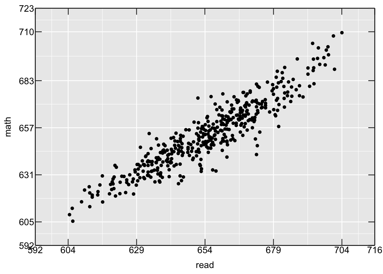
Notice, how the scales on either axis are now adjusted to (lower limit - adjustment) and (upper limit + adjustment). Also, notice that I have used the expand argument to make sure no padding is added to the end points of the scales.
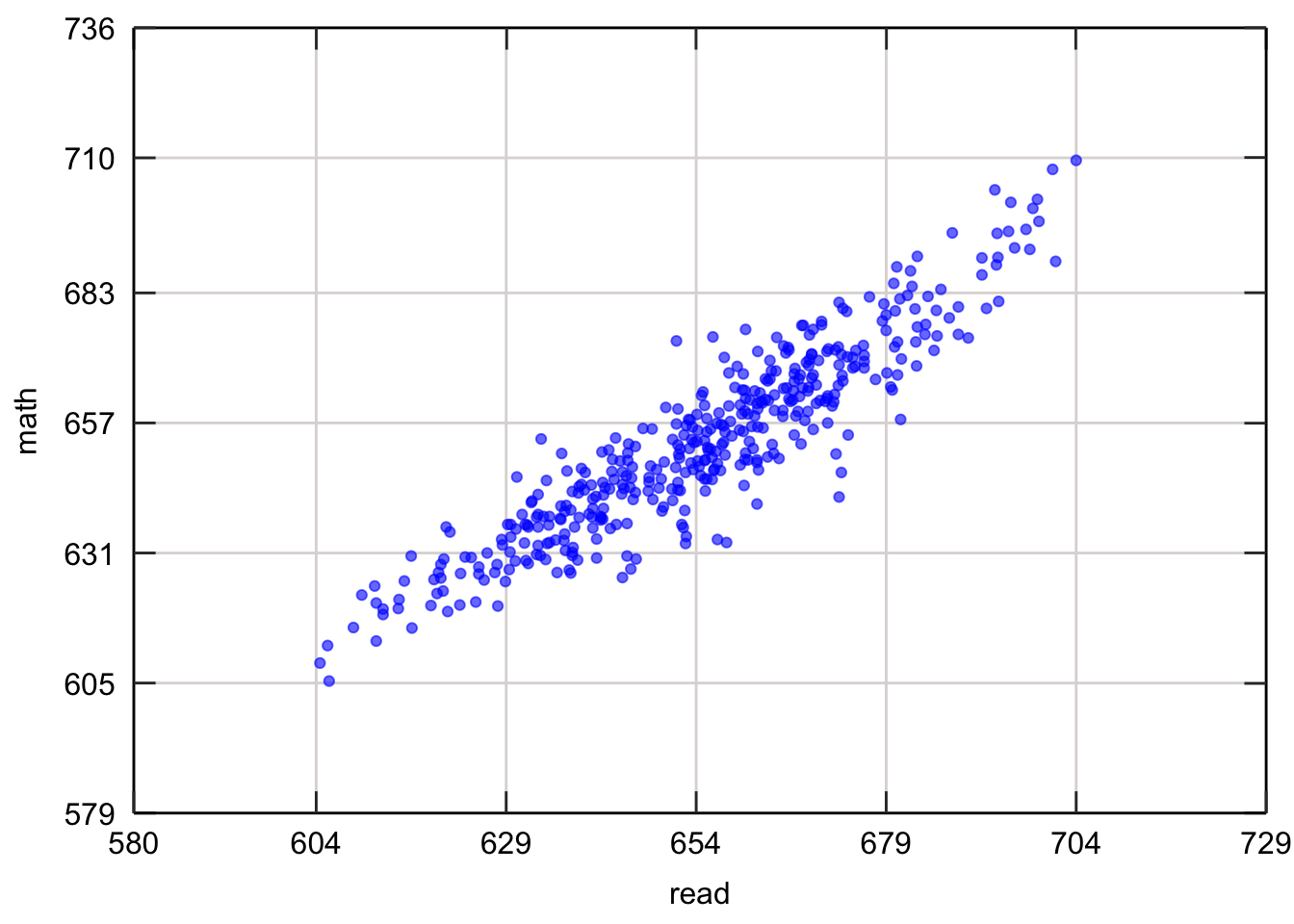
Final product
In order to fix the overlapping numbers at the origin, we can simply add some spaces to the axis text. Finally, in order to make our plot look exactly like the Matlab plot, we make the panel background white and remove the minor grids. Here is the final finished product :
theme_scientific <-
  theme(axis.line = element_line(color = "black"),
        axis.text.x = element_text(color = "black",
                                   size = 12,
                                   margin = unit(c(0.55, 0.2, 0.2, 0.2), "cm")),
        axis.text.y = element_text(color = "black",
                                   size = 12,
                                   margin = unit(c(0.2, 0.55, 0.2, 0.2), "cm")),
        axis.title = element_text(colour = "black", size = 12),
        axis.ticks.length = unit(-0.30, "cm"),
        panel.border = element_rect(colour = "black", fill = NA, size = 0.2),
        panel.background = element_rect(fill = "white", colour = "white"),
        panel.grid.minor = element_blank(),
        panel.grid.major = element_line(colour = "#ddd8d8", linetype = 1, size = 0.5))

dataset %>%
  {
    xbreaks <- round(auto_breaks(.$read, adjustment_factor = 2))
    ybreaks <- round(auto_breaks(.$math, adjustment_factor = 2))
    ggplot(., aes(x = read, y = math)) +
      geom_point(alpha = 0.6, col = "blue") +
      scale_x_continuous(breaks = xbreaks,
                         limits = auto_lims(xbreaks),
                         sec.axis = dup_axis(name = " ", labels = NULL),
                         expand = expansion(add = c(0,0))) +
      scale_y_continuous(breaks = ybreaks,
                         limits = auto_lims(ybreaks),
                         sec.axis = dup_axis(name = " ", labels = NULL),
                         expand = expansion(add = c(0,0))) +
      theme_scientific
  }
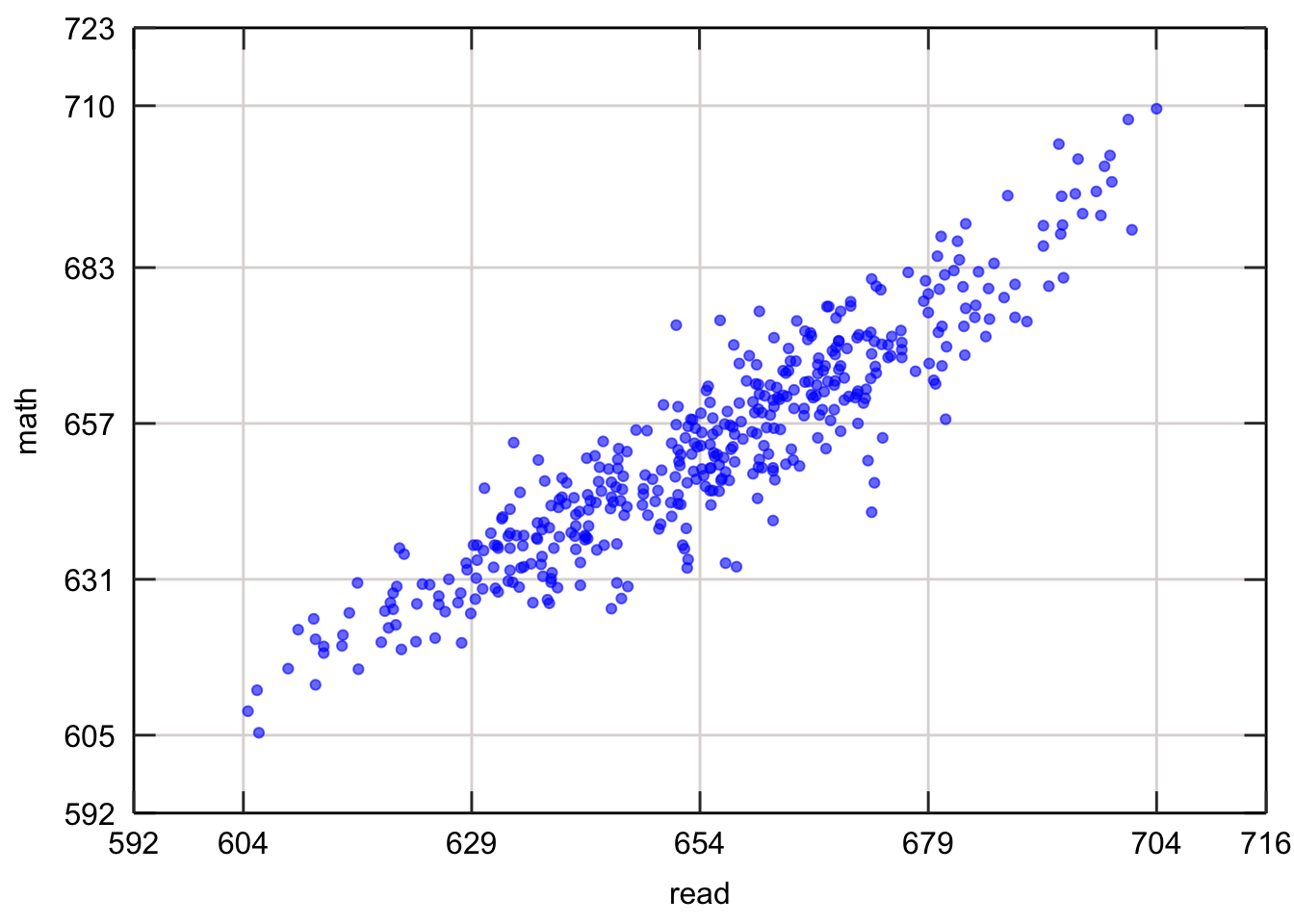
Note : Using a adjustment factor of Inf leads to unadjusted scales. While using an adjustment factor of 1 leads to adjustment equal to skip to either end of each axes. Here is the same plot with adjustment factor set to 1.
theme_scientific <-
  theme(axis.line = element_line(color = "black"),
        axis.text.x = element_text(color = "black",
                                   size = 12,
                                   margin = unit(c(0.55, 0.2, 0.2, 0.2), "cm")),
        axis.text.y = element_text(color = "black",
                                   size = 12,
                                   margin = unit(c(0.2, 0.55, 0.2, 0.2), "cm")),
        axis.title = element_text(colour = "black", size = 12),
        axis.ticks.length = unit(-0.30, "cm"),
        panel.border = element_rect(colour = "black", fill = NA, size = 0.2),
        panel.background = element_rect(fill = "white", colour = "white"),
        panel.grid.minor = element_blank(),
        panel.grid.major = element_line(colour = "#ddd8d8", linetype = 1, size = 0.5))

dataset %>%
  {
    xbreaks <- round(auto_breaks(.$read, adjustment_factor = 1))
    ybreaks <- round(auto_breaks(.$math, adjustment_factor = 1))
    ggplot(., aes(x = read, y = math)) +
      geom_point(alpha = 0.6, col = "blue") +
      scale_x_continuous(breaks = xbreaks,
                         limits = auto_lims(xbreaks),
                         sec.axis = dup_axis(name = " ", labels = NULL),
                         expand = expansion(add = c(0,0))) +
      scale_y_continuous(breaks = ybreaks,
                         limits = auto_lims(ybreaks),
                         sec.axis = dup_axis(name = " ", labels = NULL),
                         expand = expansion(add = c(0,0))) +
      theme_scientific
  }